


Kagoshima Exclusive
Client
Kanosuke
Services
Strategy
Design direction
Visual identity
Packaging
Maintain connection with your customers through branding that tells a product’s story and promise.
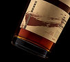
For a limited Kanosuke release of whisky matured in a single PX sherry quarter cask and a companion release matured in a first-fill bourbon cask, bottle labelling and packaging were created to deliver notable interest and resonate with whisky enthusiasts. A signature brushstroke, inspired by Japanese calligraphy, acts as a mark of authenticity and echoes practical tagging used during the ageing process. Typography, colour and texture draw on Japanese minimalism, while layout and finishing highlight origin and house style. The result is distinctive packaging presented for impact that feels authentic to the product, resonates with the target audience, and enhances visibility at shelf and online at the moment of choice.


